「Gogoro ✕ 春池玻璃」竹東城市概念店
──────────────────────
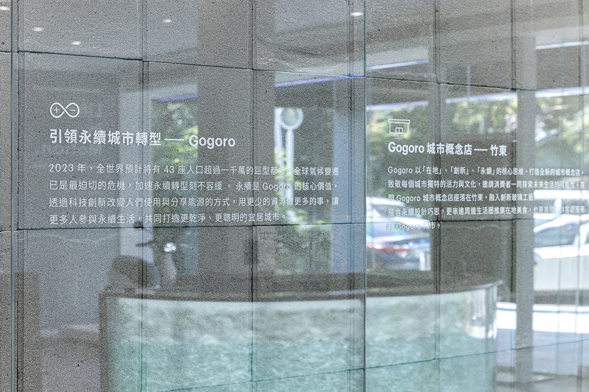
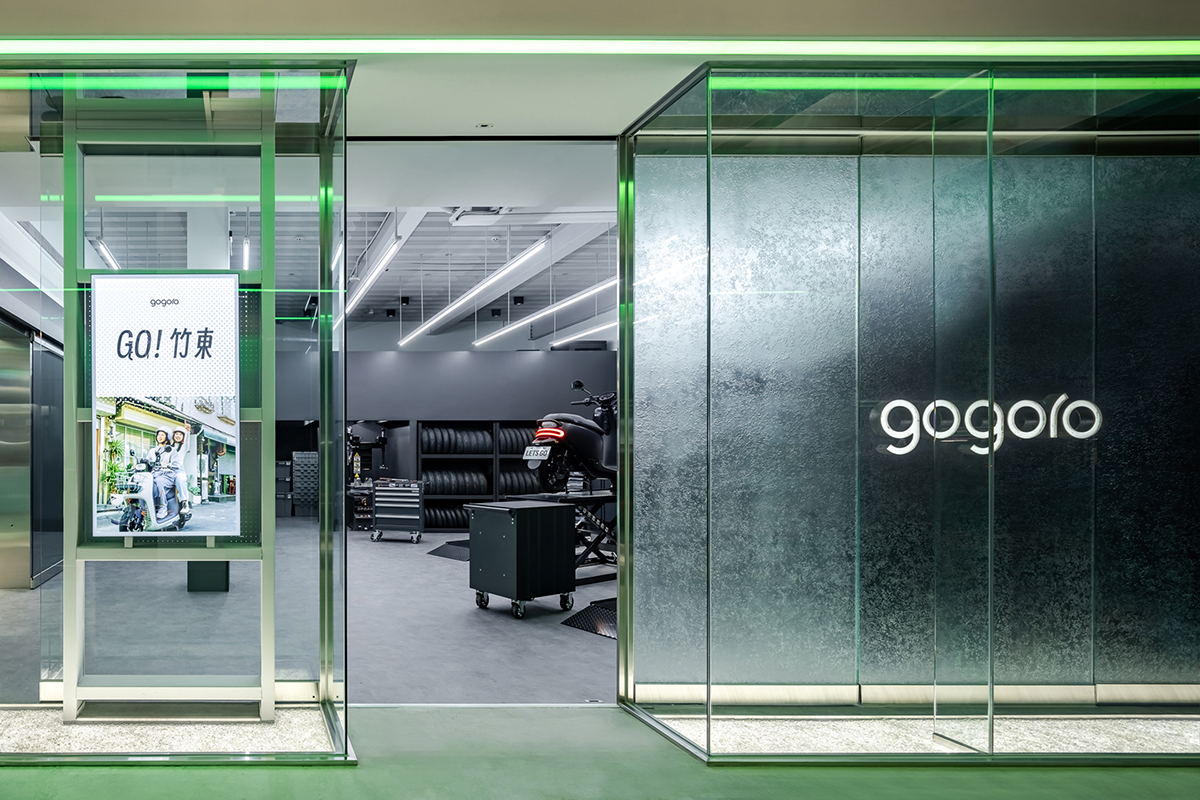
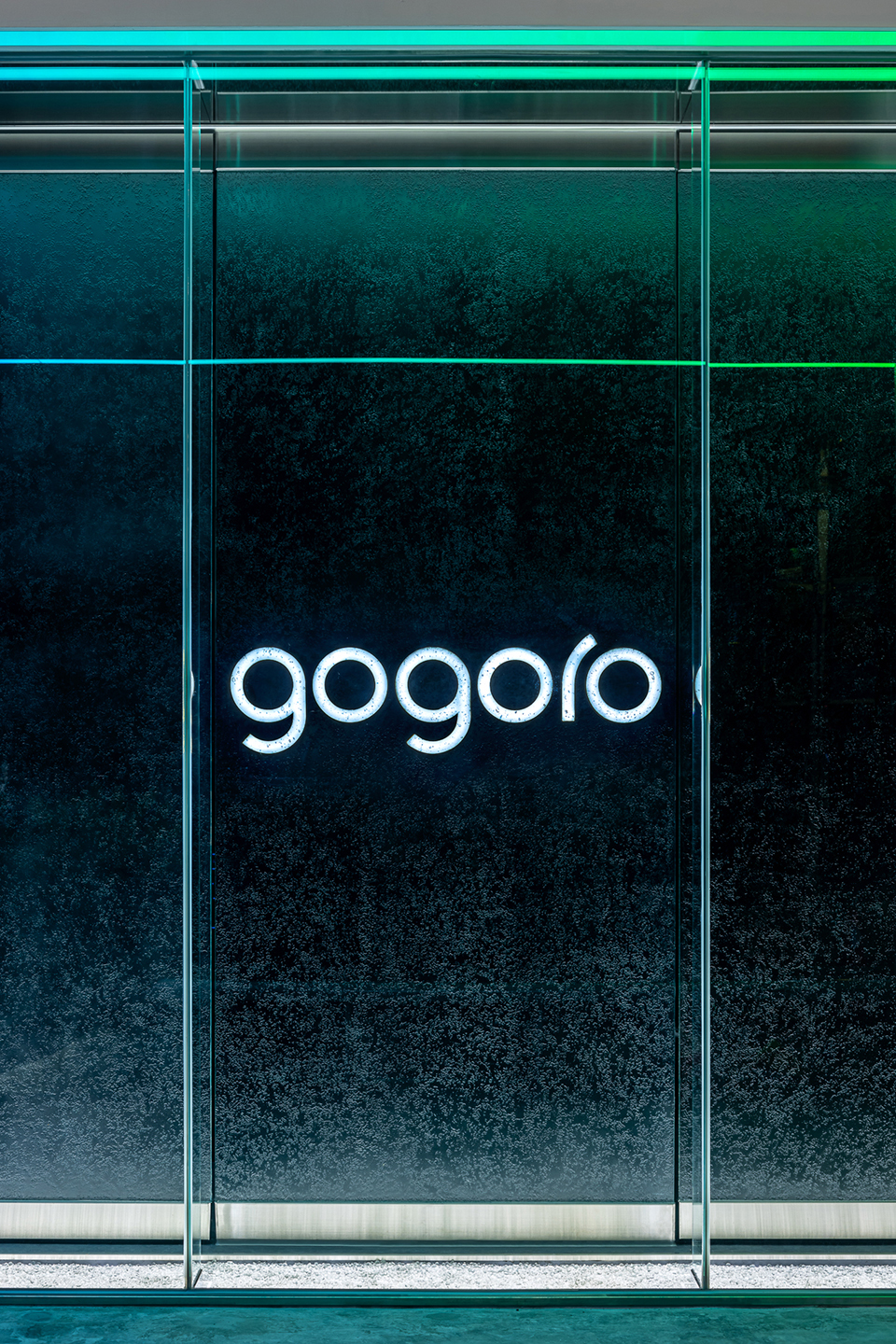
暨油電兼修的「社區店型」後,Gogoro首間「城市概念店」攜手臺灣循環經濟品牌「W春池計畫」落腳竹東,協同空間設計團隊「彡苗空間實驗」,共同以永續思惟並融入地方基因,打造出專屬於竹東的Gogoro客語「透明系玻璃門市」。
‥‥‥‥‥‥‥‥‥‥‥‥‥‥‥‥‥‥‥‥‥‥‥‥‥‥‥‥‥‥‥‥
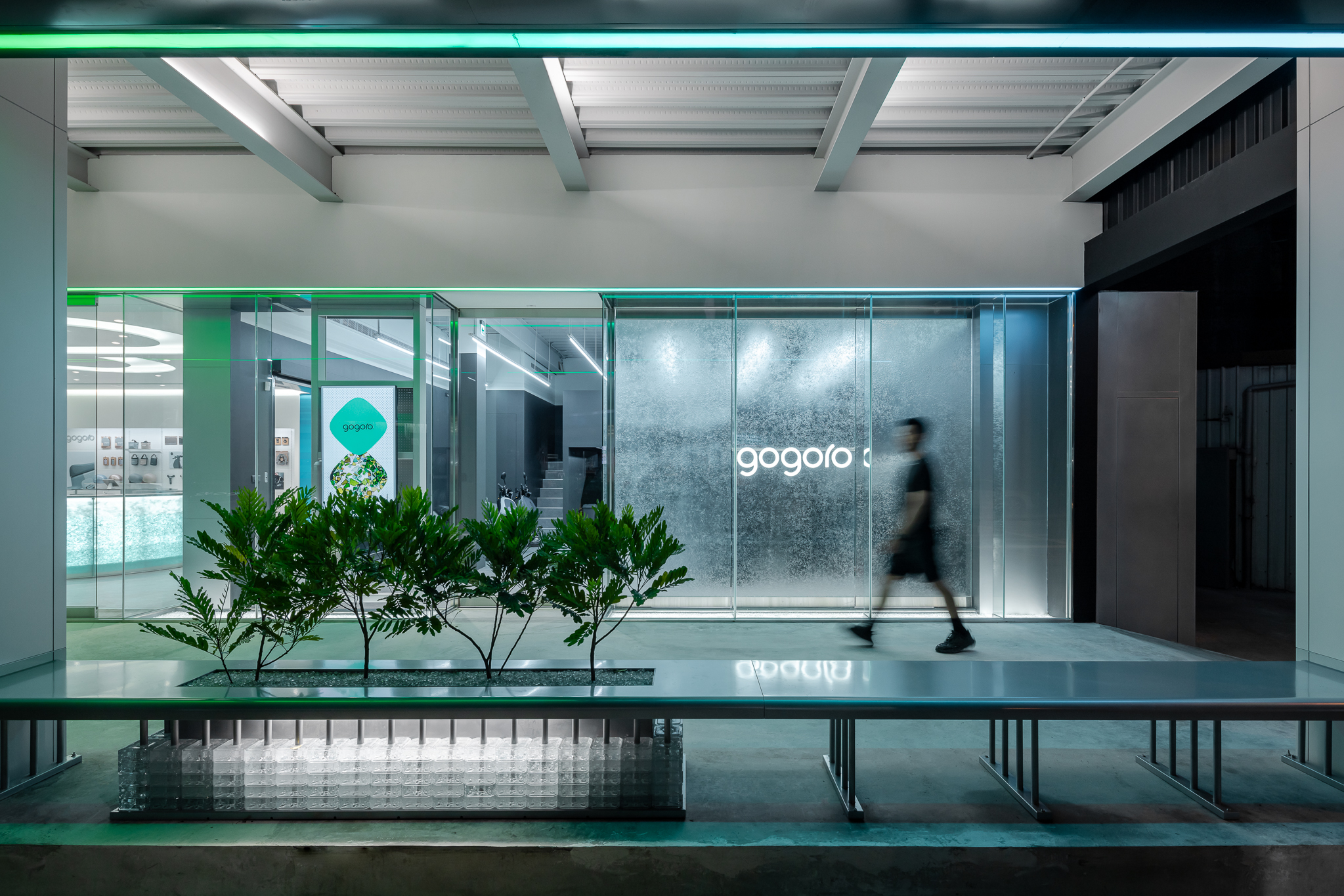
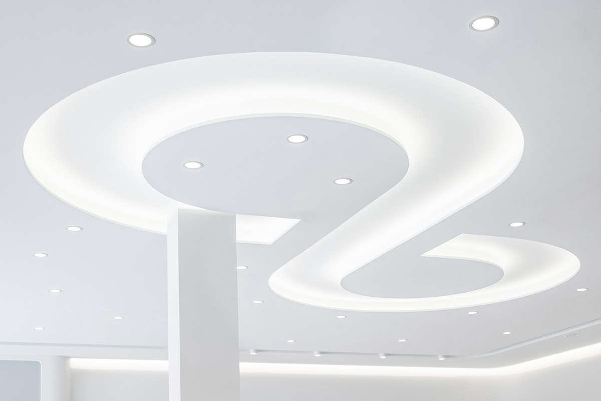
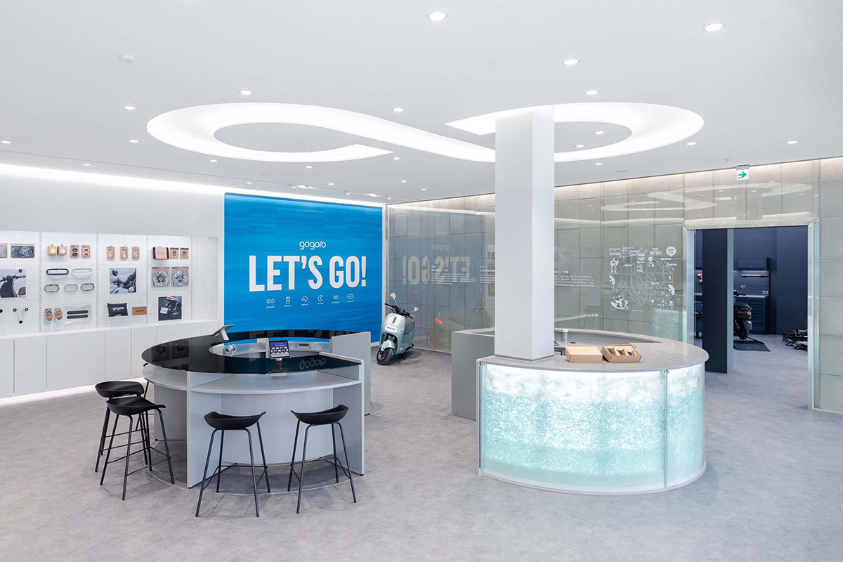
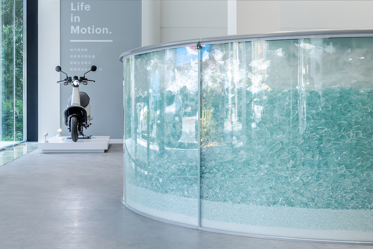
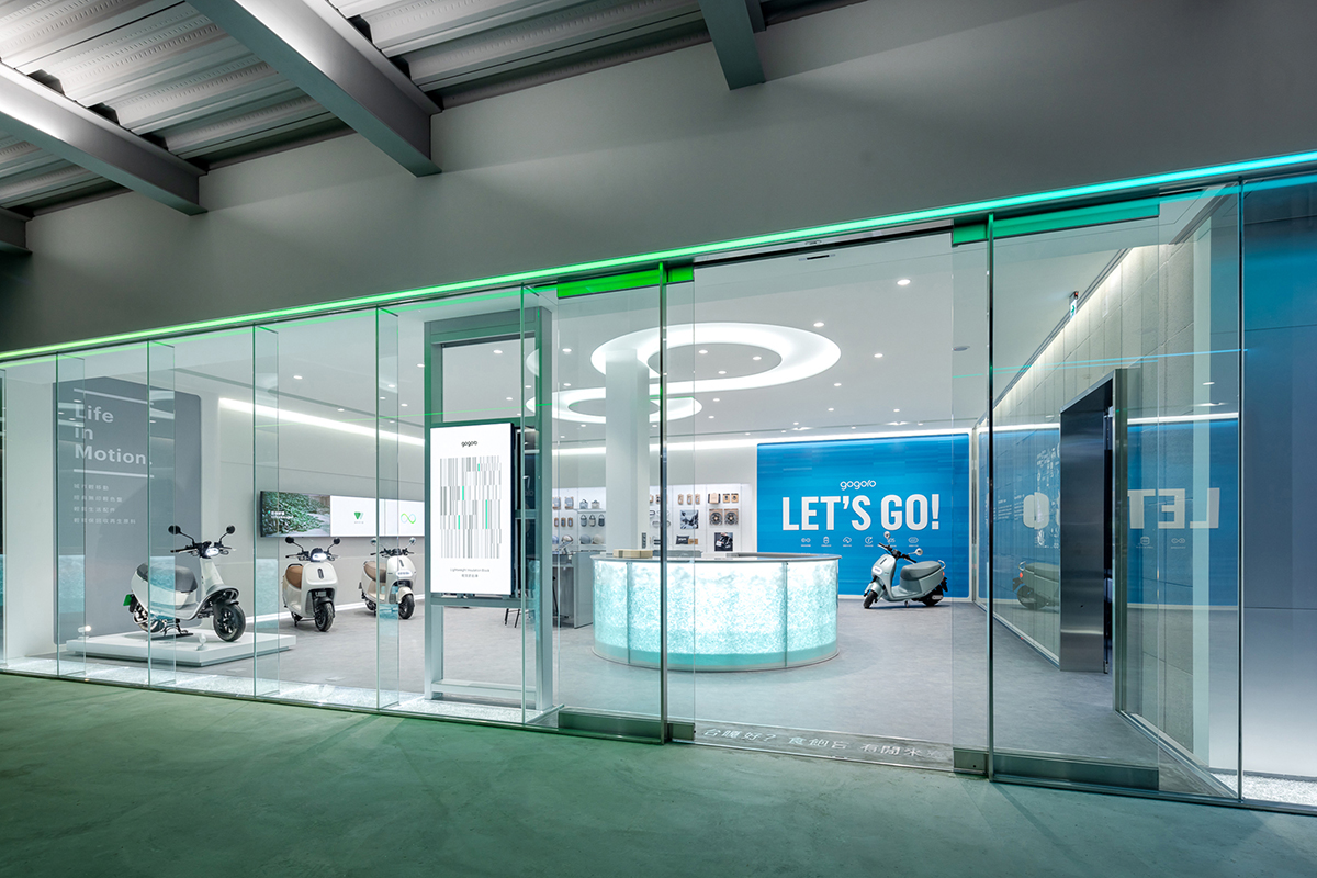
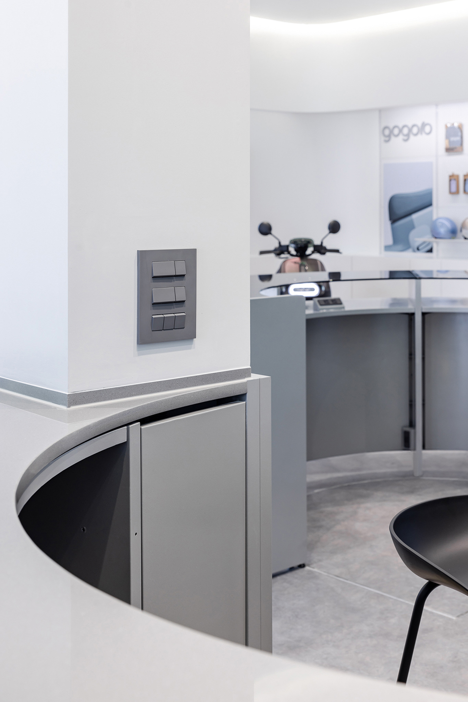
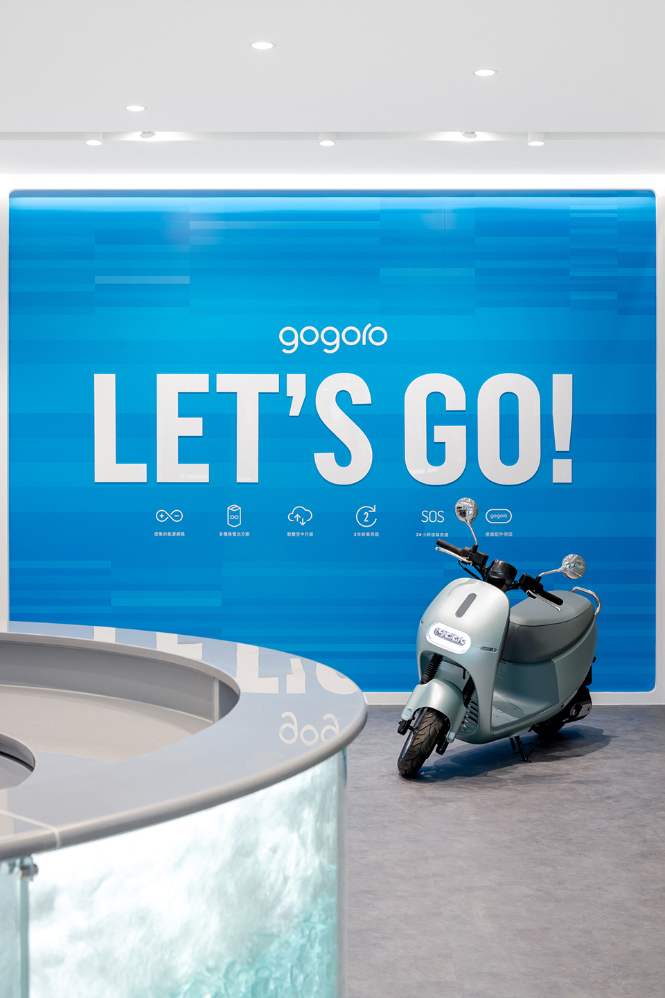
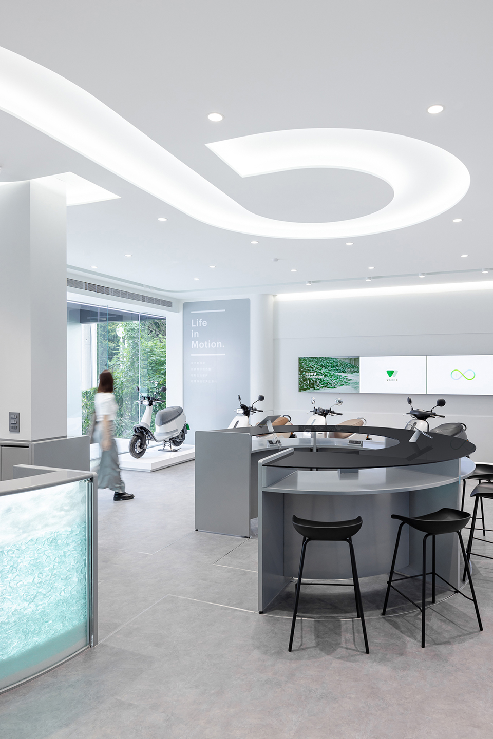
設計概念源於Gogoro電力服務的POWER LOOP —「∞」符號,以雙弧曲線交疊象徵創新與能量的循環,在RS空間中心立體化為兩座玻璃組構成的服務櫃台,整合現有門市中從接待、展售、洽談、選配商品到交車打卡等銷售流程,於環繞櫃檯完成售服步驟的同時也將顧客自身帶入「∞」LOOP中,成為永續能源循環的一員。
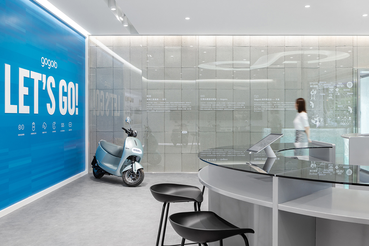
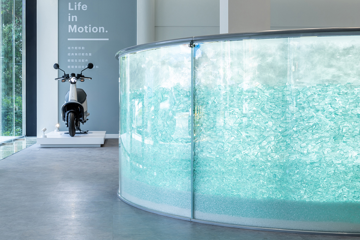
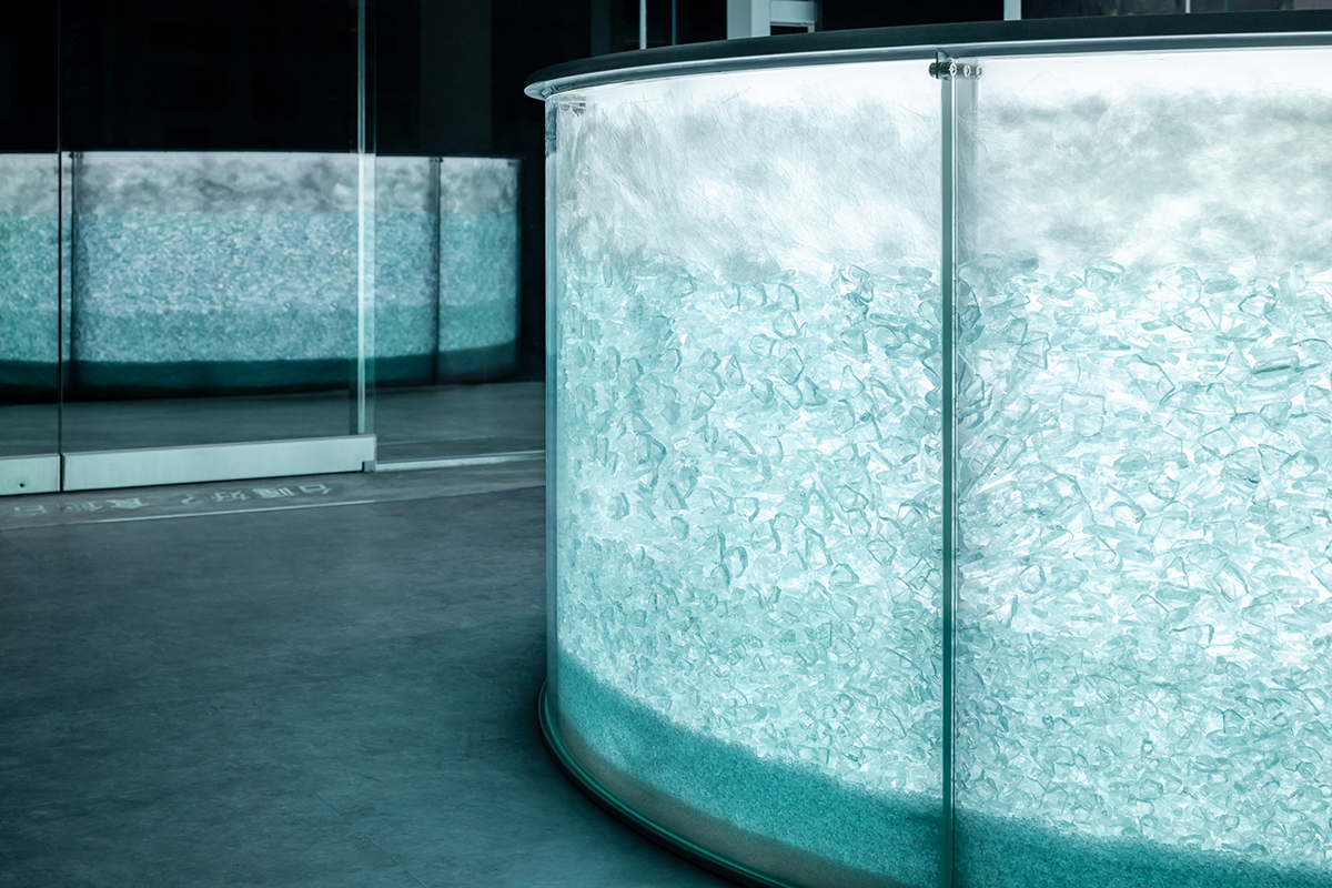
面對門市入口的接待櫃台,於弧型玻璃內填充五種不同粒徑與來源的回收玻璃廢料,在不經意地行走間折射燈光不斷閃爍。由小至大的顆粒組構如夯土般層層堆疊的立面畫面,描繪玻璃器皿於回收再生中逐步滾動、碎形的過程,同時回應Gogoro品牌在建立循環能源網絡與提升工業技術中持續去蕪存菁、向上升級;內側的洽談櫃台以灰玻作為檯面延續玻璃語彙,簍空的桌體結構與接待櫃檯的夯實產生的輕重對比。門市人員可於櫃台內弧中逐步完成接待到洽談作業,順著「∞」記號整合收納、收銀形成屬於售服的機能LOOP。
───────────
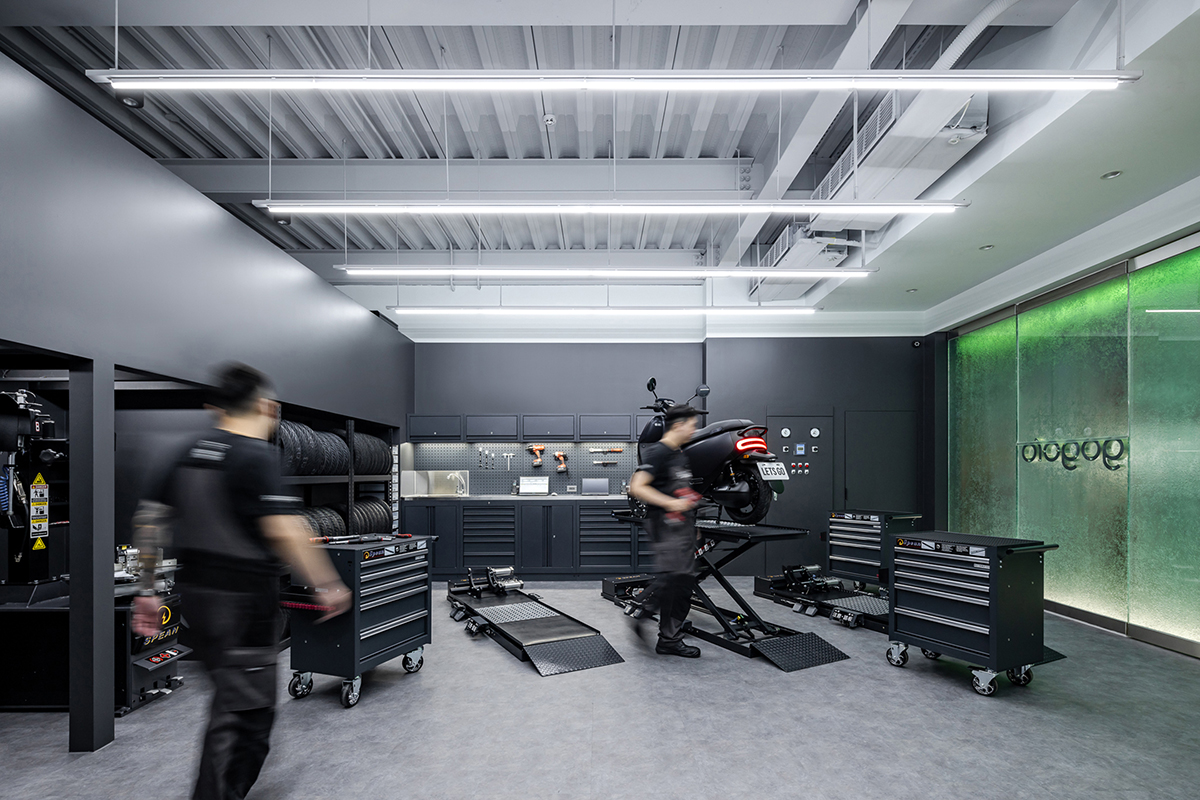
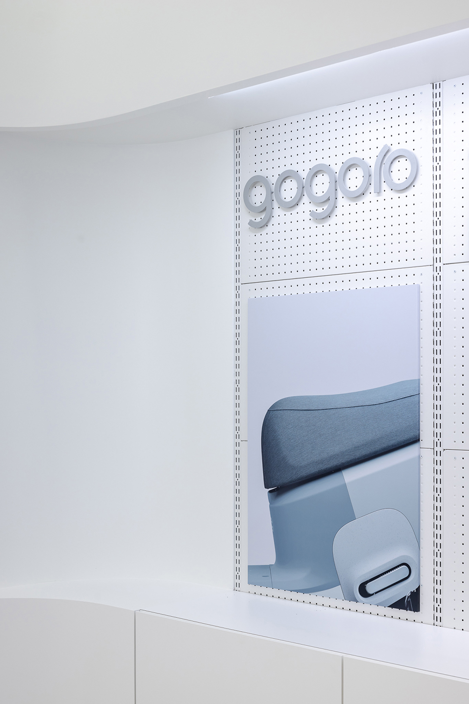
對應於「玻璃」的通透質地,透明化的維修服務空間拉近與顧客間的距離,透過三道落地的蝕刻玻璃形成半透明的展示櫥窗。玻璃上方掛載的Gogoro氣泡玻璃燈字由春池的玻璃師傅手工製成,以特殊工法使氣泡漂浮於玻璃內部,工藝般精緻的玻璃紋理與CS(維修)空間的專業形象產生對話,並與Gogoro企業對品牌品質的追求相映生輝。
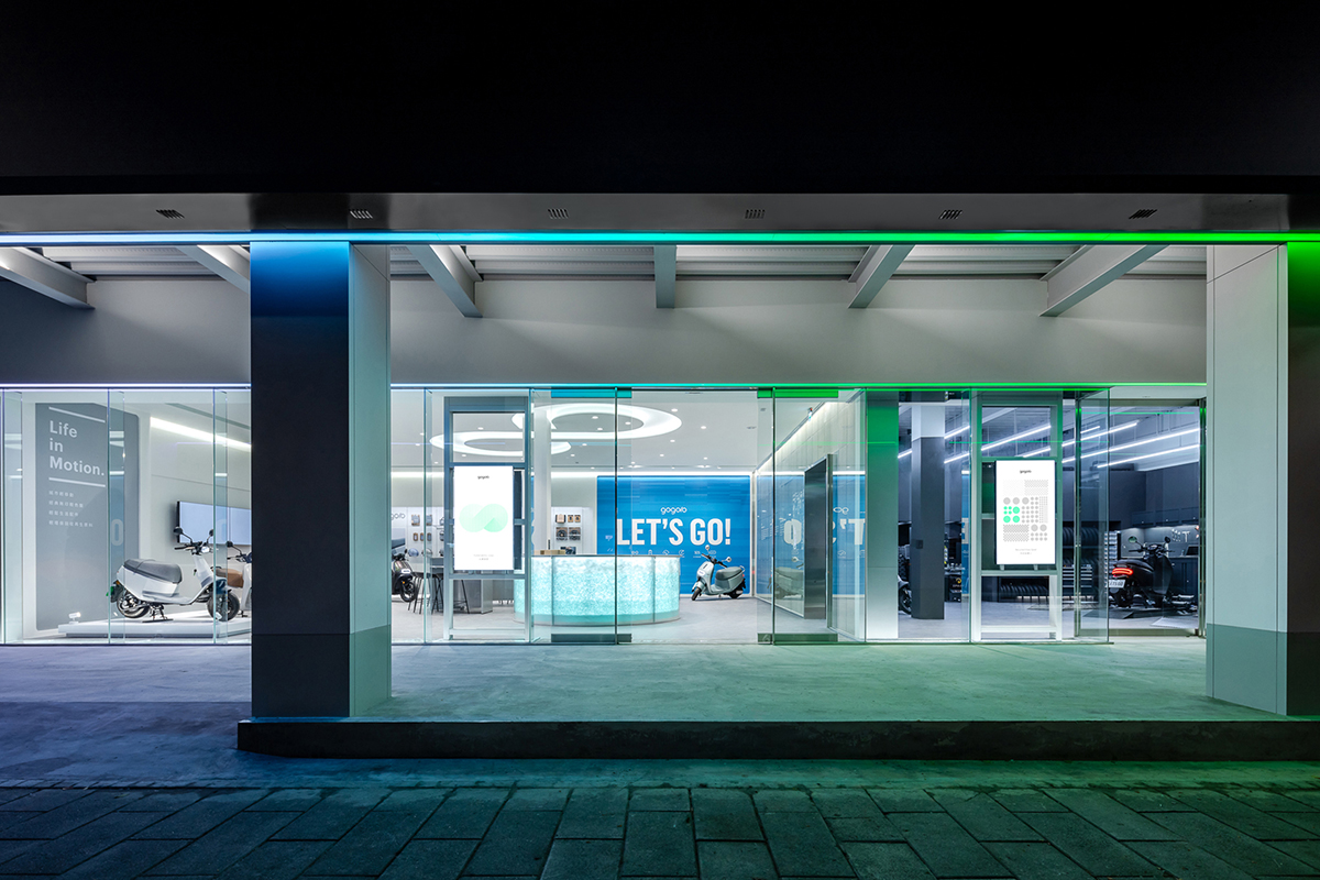
由一道10M落地玻璃包覆的透明門面,穿透的視覺畫面中展現柔美的銷售空間與俐落的維修空間,形成有趣且鮮明的對比。兩區空間以一道輕薄牆體界定,面材堆砌的「輕質磚」是由「春池玻璃」將螢幕的面板玻璃(LCD)回收,混和水泥再製而成,經發泡後自然產生蜂窩狀的紋理除特殊形體外,兼具防火、隔音、隔熱等功能使兩空間能夠更穩定運行。
───────────
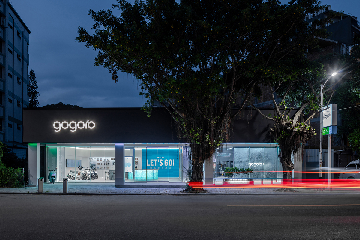
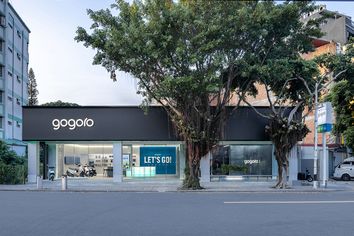
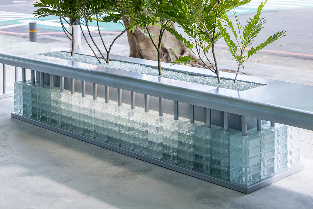
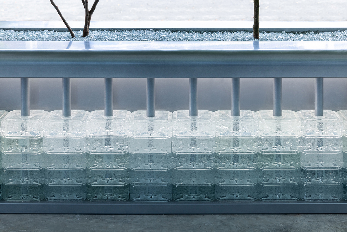
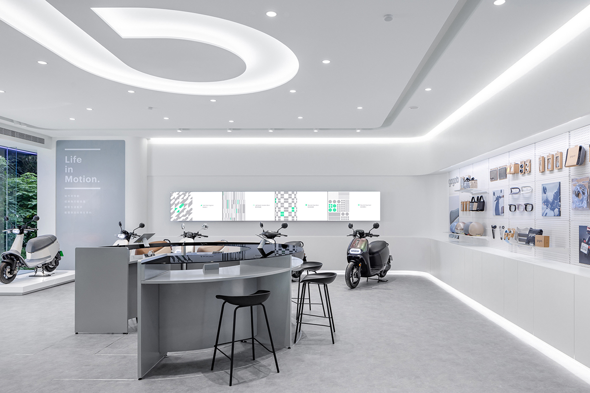
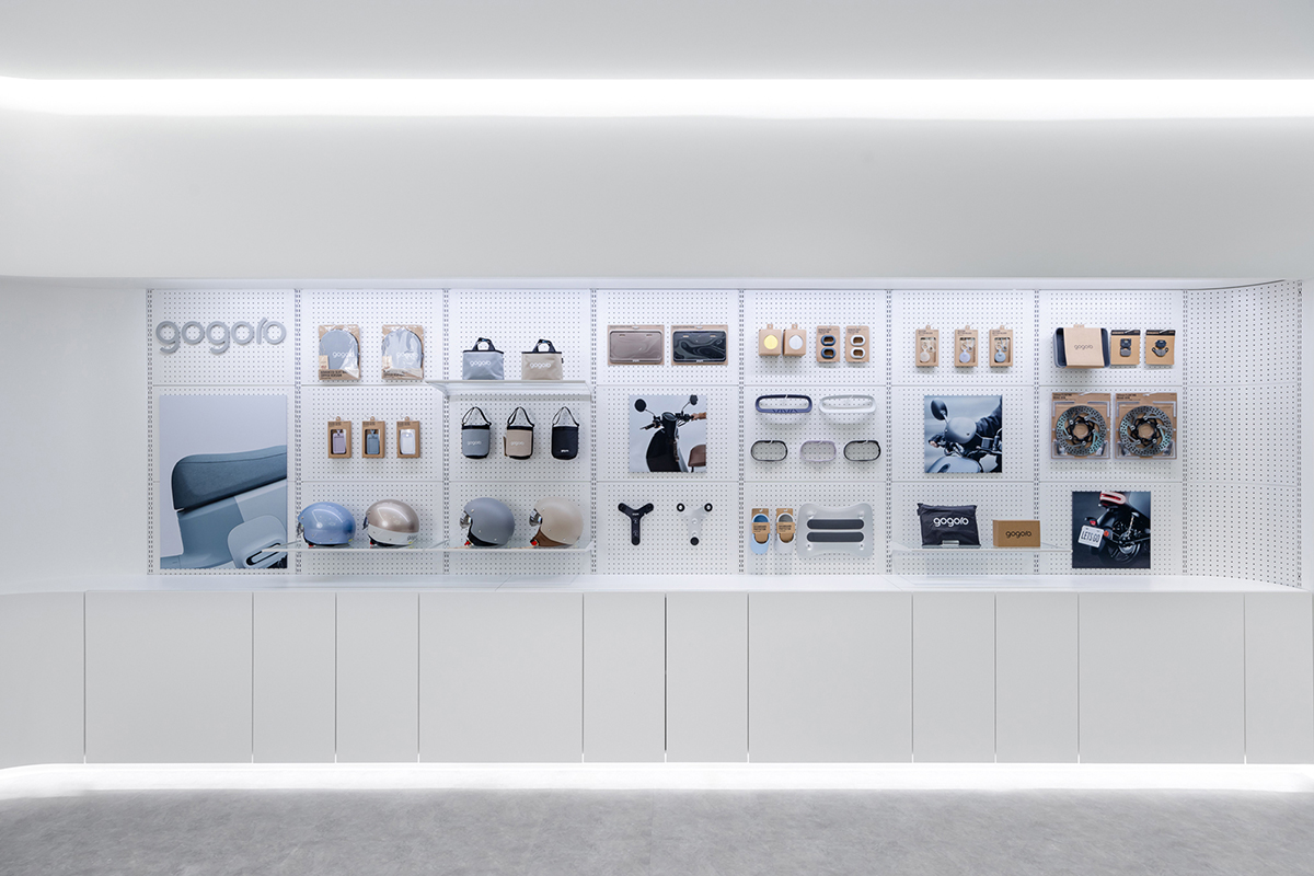
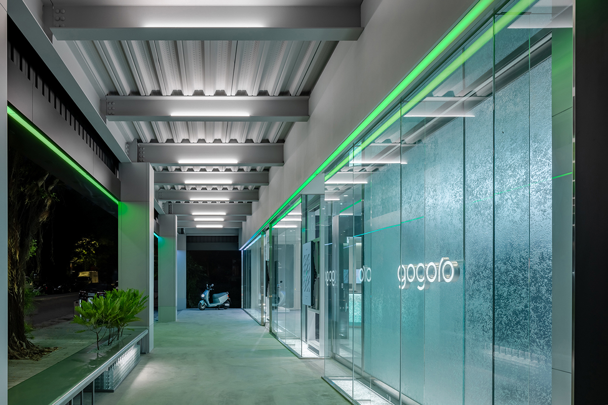
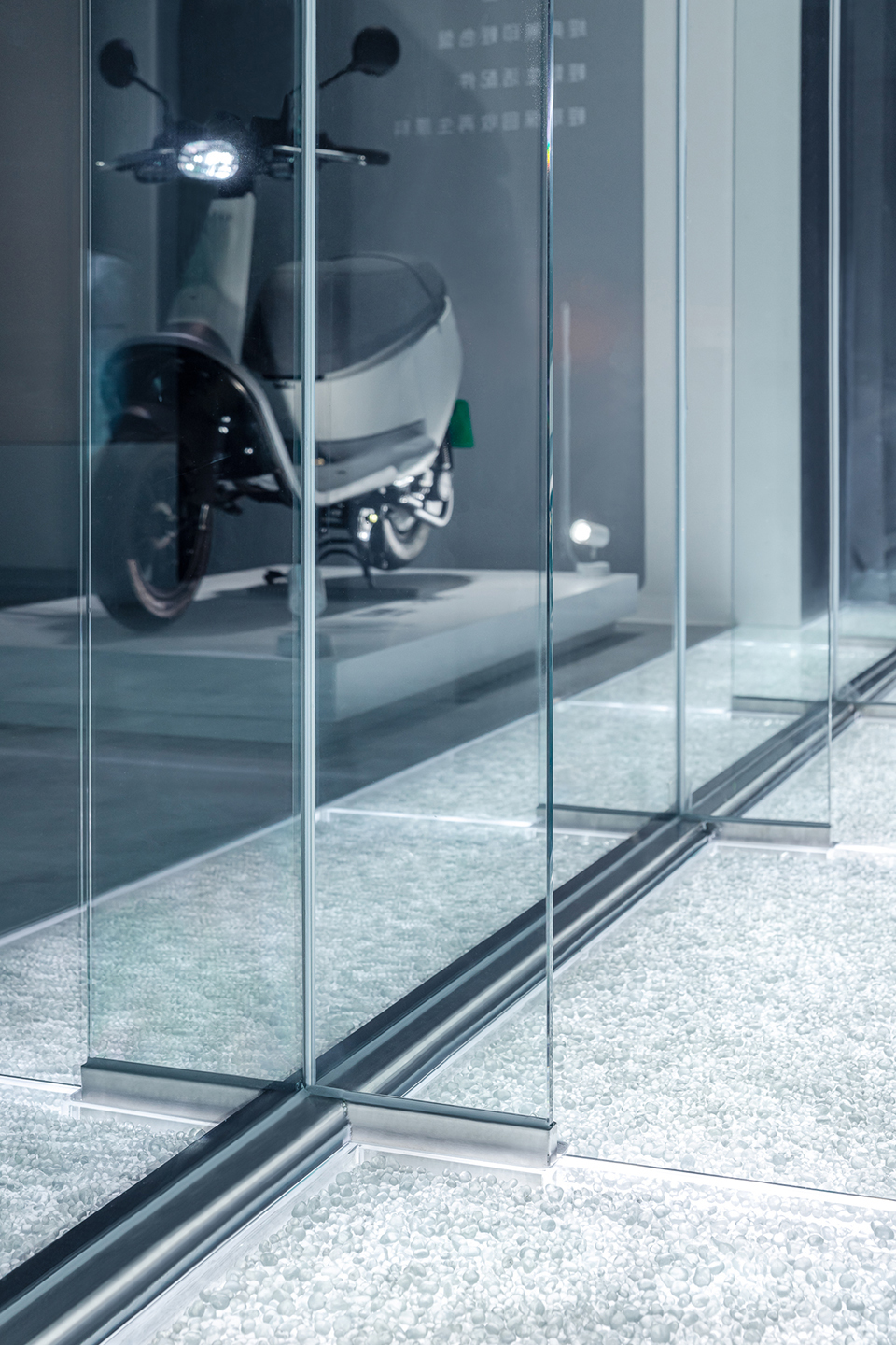
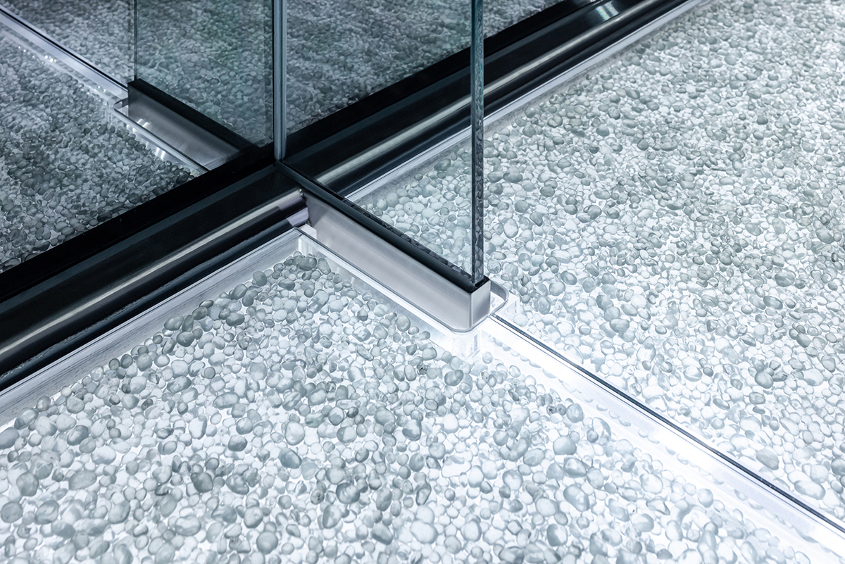
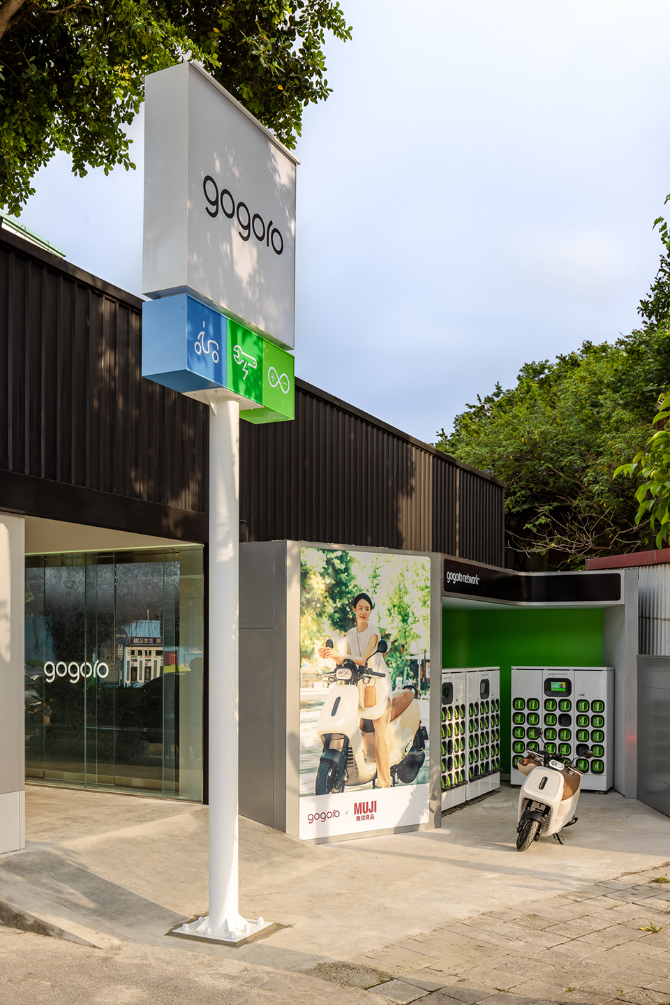
延續品牌剛剛好的設計作風,將車體圓潤語彙蔓延至空間細節,乾淨的立面線條整理影像與商品的陳列視覺,搭配天地燈光賦予空間溫和表情。建築外的GoStation®可從竹東圓環一眼望至。隱約露出收錄於騎樓屋簷兩側的動態燈帶「POWER BAR」,由藍而綠的色彩變化象徵能量存駐與流動,並成為迎接賓客的指引。玻璃經碎形後,滾圓再生成的「琉璃沙」鋪設於廊道地燈上方,剔透的光暈照亮騎樓空間。同為循環建材的「冰塊玻璃磚」作為結構砌於騎樓座椅椅腳,搭配燈光渲染使視覺輕盈、豐富。透過門市中各式回收玻璃的使用與搭配,期許在車輛展售體驗的同時構築大眾對於玻璃與循環材料的新印象。
───────────
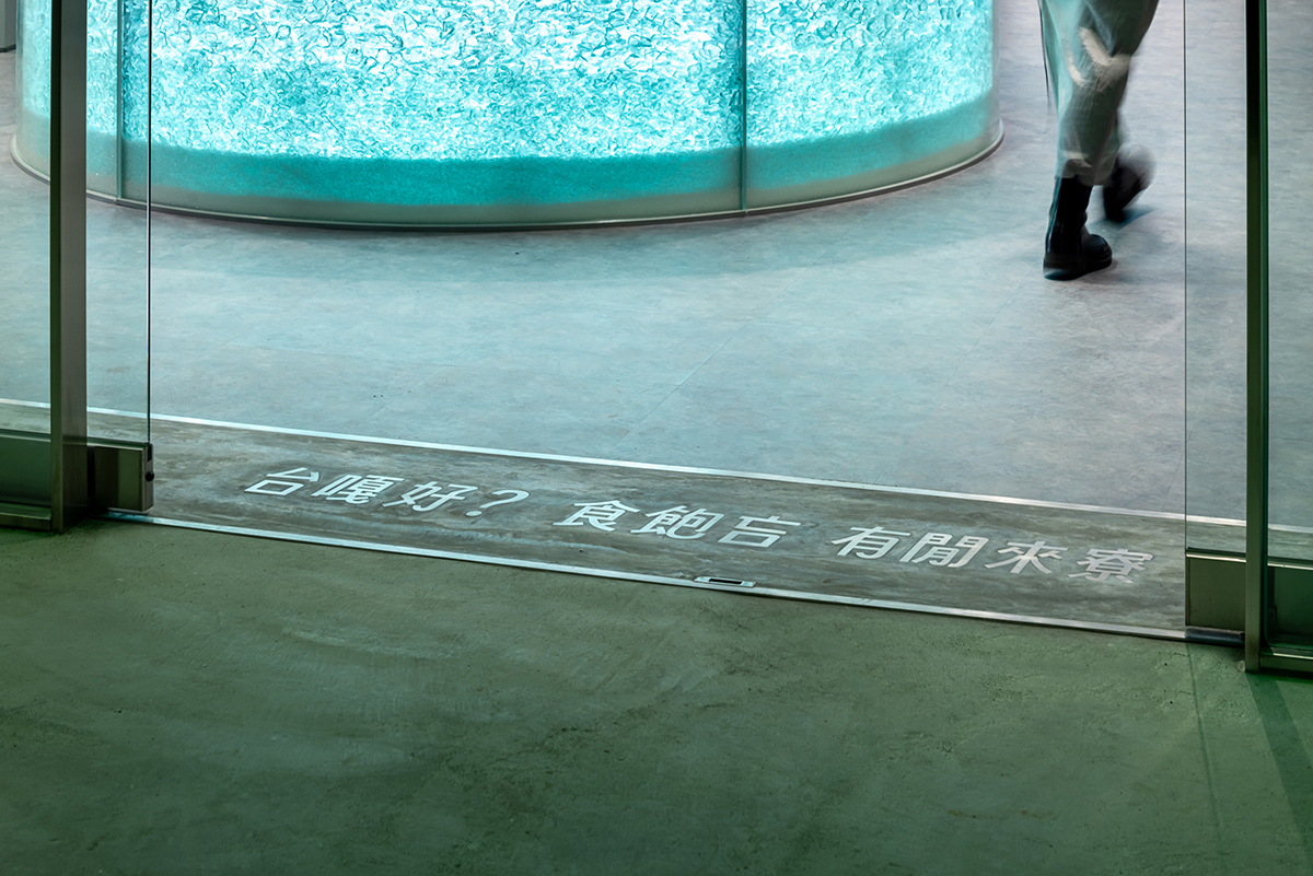
「 台嘎好 ! 食飽吂 ? 有閒來寮 」
彷彿一聲鏗鏘有力的客語問候,親切向竹東問好,以金屬字鑲嵌於入口地坪。自日治時代起,竹東就成為玻璃工業的重要據點,竹東概念店透過100%可循環回收的再生建材–「玻璃」的介入,喚起老一輩新竹人的共同城市記憶,也更映照出Gogoro與春池企業對永續能源和台灣在地色彩的關注與投入,期許能更貼近地區生活並展現新的永續風潮!
“Gogoro X Spring Pool Glass” Zhudong City Concept Store
──────────────────────
After its community stores that afford both fuel and electric motorcycle repairs, Gogoro established its first “city concept store” in Zhudong in collaboration with the “W Glass Project” of Taiwan’s circular economy brand “Spring Pool Glass” and the spatial design team “seed spacelab.” They blend sustainable thinking into local elements, creating a “transparent Gogoro store” exclusive to Zhudong with the greetings in Hakkanese.
‥‥‥‥‥‥‥‥‥‥‥‥‥‥‥‥‥‥‥‥‥‥‥‥‥‥‥‥‥‥‥‥
The design concept is based on “∞,” the symbol of Gogoro’s POWER LOOP services. The imbricated dual curves on the ceiling imply the cycle of innovation and energy. The symbol is transformed into a solid service counter composed of two glass cabinets at the center of the RS space, which integrates the entire sales process including reception, demonstration, negotiation, selection, delivery, and check-in. The customers enter the “∞” loop and become part of the sustainable energy cycle as they walk around the counter to complete the sales and service process.
───────────
The reception counter directly faces the store’s entrance. Its arc-shaped glass is filled with five layers of recycled glass waste different in source and grain size. People who walk casually around the counter will see the glass waste refracting the light into the twinkle of grains. Its rammed earth-like configuration comprises particles from small to large, which not only recounts the rolling and breaking processes of glassware recycling but also reflects Gogoro’s constant endeavor to refine and upgrade itself in terms of circular energy network and industrial technology. The business counter at the inner flank employs a gray glass top to continue the vocabulary of glass. Its fretwork structure provides a direct contrast with the solid reception counter. The salesclerks can receive and negotiate with customers, keep customers’ files, and help customers check out step by step along the inner arc of the ∞-shaped service counter, thereby forming a functional loop of sales and services.
───────────
With the transparent texture of glass, the visible maintenance space beckons, inviting customers to come closer to it. The translucent floor-to-ceiling display windows comprise three panels of etched glass. The “gogoro” bubble glass lights hung on the display windows are handmade by the glassblower from the Spring Pool Glass, using a special technique to make the bubbles float inside the glass. The exquisite glass texture not only creates its own dialogue with the professional image of the CS (maintenance) space, but also makes Gogoro’s pursuit of brand quality shine more brilliantly.
───────────
The store’s façade is wrapped with a piece of 10-meter long transparent glass, behind which the graceful RS space and the elegant CS space unfold, offering an intriguing and vivid contrast. The two spaces are demarcated by a wall as light as thin. The wall is built with the Spring Pool Glass’ “lightweight bricks” produced by mixing cement with glass recycled from LCDs. In addition to their special shape with the naturally formed honeycomb-like texture after foaming, these bricks have multiple functions such as fire prevention, acoustic absorption, and thermal insulation, allowing the two spaces to operate in a more stable fashion.
───────────
Following the “no more no less” style of the brand, we extend the smooth-and-round vocabulary of its products into the details of this space. The clean contour lines of the façade streamline the display of images and products, and this space wears a gentle expression in the overall lighting ambience. The GoStation® outside the store can be seen from Zhudong Roundabout without hindrance. The dynamic light strip “POWER BAR” is faintly discernible on both sides of the arcade’s eaves. Its color changes from blue to green, symbolizing the storage and flow of energy and serving as a beacon that greets customers. The “recycled glass powder” is applied to the surface of the in-ground lights along the corridor, and the resultant translucent halo illuminates the arcade. The “ice-cube glass bricks,” a kind of recyclable construction material as well, are laid around the legs of the arcade bench, which exudes a graceful visual charm in the rendering of light. Ingeniously utilizing various recycled glass, we expect the public to gain a new impression of glass and recyclable materials while experiencing the brand’s products.
───────────
“tai ga´ ho`,” “shidˋ bau^ mangˇ,” “iuˊ hanˇ loiˇ liau.” (In English: Hello, everyone. How’s it going? Come visit us if you are available.)
Embedded in the floor at the entrance, the metal characters of these three powerful greetings in Hakkanese send kind regards to Zhudong people. Zhudong has been a stronghold of the glass industry since the Japanese colonial period. Therefore, with the introduction of glass, a kind of building material that is 100% recyclable, this concept store rekindles the memories shared among senior citizens of Hsinchu. This store further reflects the concern and commitment of Gogoro and Spring Pool Glass regarding sustainable energy and Taiwan’s local flavor. We expect this concept store to become part of the local life and start a new trend for sustainability!
‥‥‥‥‥‥‥‥‥‥‥‥‥‥‥‥‥‥‥‥‥‥‥‥‥‥‥‥‥‥‥‥
▌Gogoro 竹東東林概念店
空間業主 |
Gogoro Taiwan ✕ 春池玻璃 Spring Pool Glass
合作部門 |
Gogoro Brand Center
Gogoro Store Development Team
Gogoro Retail Marketing
執行統籌 |
W春池計畫 / W Glass Project.
空間統籌 |
彡苗空間實驗
專案主持 |
樂美成、鄭又維、羅開
設計執行 |
袁如玉
設計協力 |
李耘萱、陳繪羽、林家維
燈光統籌 |
瓦豆
識別設計 |
Gloria Mak
工程執行 |
澄邑室內裝修、歐悦設計oyattdesign、
生木科技玻璃 、典漢實業、石更文創 Led 亮化工程、
新方水電、鼎軒人造石、鋒瑩鐵材、
幸中家具實驗室 SJ Furniture LAB、
美五金實驗室
植栽選配 |
CornerGreen植角植物店
特別感謝 |
明睿智能團隊、馮國偉、 莊志維、
簡廷禎Duke、何明修 Show Ho
空間攝影 |
丰宇影像
▌
2024金點設計獎|獲獎
「 Gogoro × 春池玻璃 」竹東城市概念店 榮獲 #2024金點設計獎 標章
#竹東 #Gogoro #春池玻璃 #W春池計畫 #彡苗空間實驗